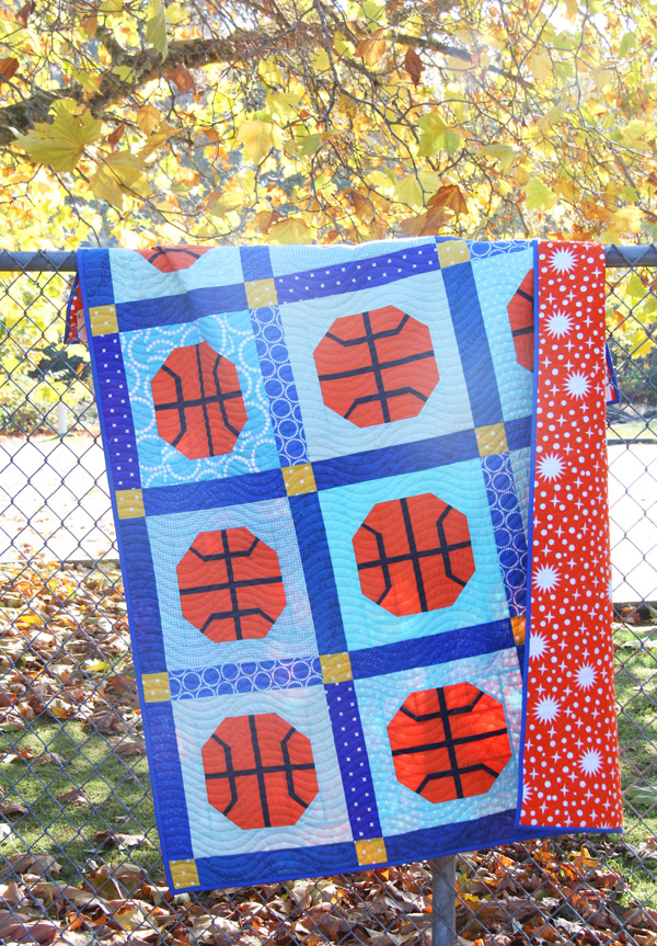
When I first wrote the Slam Dunk pattern, I made it with print/scrappy sashings in between the blocks. I wrote the pattern, made the quilt, Kaitlyn quilted it, and then I took it to the park to photograph it....and I realized I didn't like it! Ugh!
The dark blue print sashing was just too much and it drowned out the light blue prints around the basketballs. Especially the pearl bracelets print...the print is crooked (drives me nuts!) but I didn't really notice while I was making it.
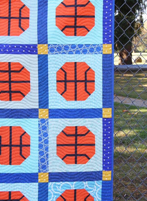
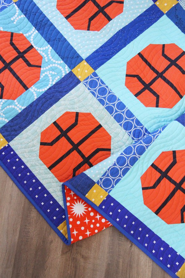
Long story short...I re-wrote the pattern to what it is now with the single fabric sashing strips, and it's much easier on the eyes. Here is my previous post on Slam Dunk, or the pattern is here. This version with blue sashing is the exact same pattern but looks so different!
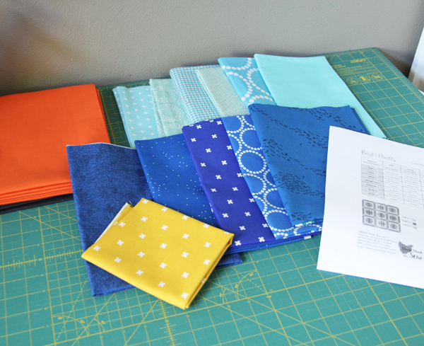
I still love this version even though it didn't make the cut for the pattern, and adding the extra prints can add some extra interest and variation with all the orange basketballs. If you want to make it this way with print strips, you'd simply cut the needed sashing strips out of yardage or fat quarters instead of buying the background fabric. You can get about 7 sashing strips from one fat quarter, so just count the number you'll need in the layout diagram, then divide by 7 and that's the number of fat quarters you'd need for the background. Or just cut them from scrappy yardage. Other than that the two patterns are identical.
Kaitlyn did a fabulous job with the quilting, and the background is a really fun Robert Kaufman 108" wide back.
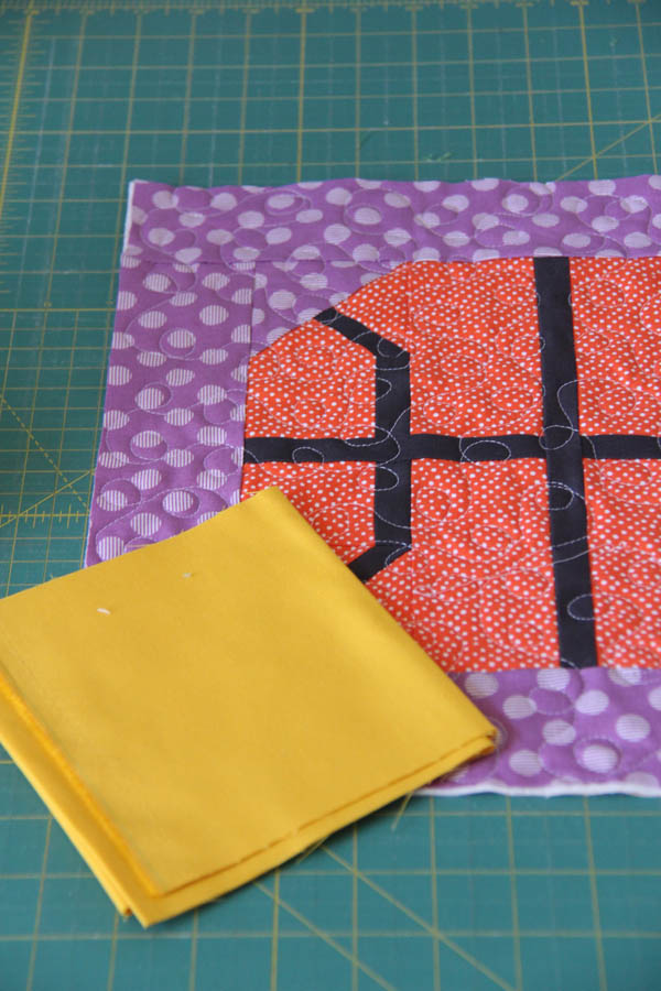
Since I can't get enough of sewing basketballs (insert A LOT of sarcasm), I made one block for a pillow to give our babysitter in her team colors.
Now I have two basketball quilts all finished just in time for baseball season!!!
(No I am not making a baseball pattern anytime soon!)
Happy Baseball Season!


Elisabeth
I love the last comment on baseball :-)
Emily
I have your pattern and plan to make it with single sashing and single backgrounds but all the basketballs will be different (to look like new, used, weathered, etc). I haven't made it up yet, but that's my plan. I love that we can interpret your patterns to our own likes!
Allison
That's a great idea Emily! I love seeing the variations on the same pattern!
Julie
I appreciate that you share your behind-the-scenes thought process. Both versions are fun and vibrant, though as a true-blue lover, I actually prefer the first version!
But those pearl bracelets... WHY ARE THEY PRINTED CROOKED?!?! (Not yelling at you!) I've noticed that on the fabric and never bought it, because it's crooked. I would have to cut it on the bias and would drive myself all sorts of crazy.
Anyway, well done!
Jude
The pearl bracelets being printed crooked DRIVES ME NUTZ as well!!!! I only bought in a couple of colors and realized....but honestly Allison, I love the original version in the royal blue sashings...I am used to the pearl bracelets being crooked by now and it just seemed fine, my eye is used to it! I love the royal blue! Funny! Either way it is a great pattern and both quilts are marvelous as always!!! Miss you......
Carla Kennedy
Cute pattern. The crooked didn't bother me but I'm easy. Love the backing.
Anon
I really like both variations.
How about a hockey quilt someday? 😊
Allison
Seattle is about to get a Hockey Team...so maybe someday! ;)
cocoya
Looks like a fun pattern for using some modern fabric from my stash!
ไพ่ออนไลน์
Gclub
Laura Wyman
On the basketball quilt can you tell me what blue background fat quarters you used for each basketball block?
Allison
They were just a wide variety I bought in a pack from fatquartershop.com Cotton and Steel fabrics have great blues, I just searched on fatquartershop.com by color, for dark royal blues and picked some.